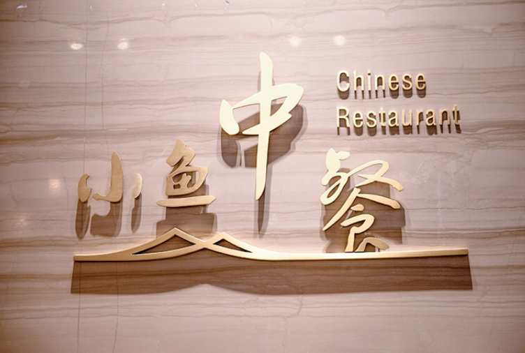
Choosing between flat-cut and built-up lettering requires more than comparing the apparent depth of individual characters. Commercial signage projects must account for brand identity, viewing distance, installation surfaces, lighting requirements, material selection, maintenance, and budget. Each construction method creates a different visual effect and serves different practical purposes. By understanding these distinctions, project planners, designers, and signage buyers can specify lettering that meets the requirements of the building and the intended communication environment.
Understanding the Structural Difference Between Flat-Cut and Built-Up Letters
Flat-cut lettering is produced by cutting individual characters or shapes from solid sheet materials, such as acrylic, aluminum, brass, or stainless steel. These pieces retain the profile of the selected material and can be finished with paint, brushing, polishing, or other surface treatments. FCO letters are generally non-illuminated, making them suitable for projects that prioritize clean outlines, material texture, and straightforward installation.
Built-up lettering, by comparison, uses fabricated sides and faces to create a hollow or enclosed three-dimensional form. Depending on the design, these letters may accommodate internal lighting or use unilluminated construction to emphasize physical depth. The additional fabrication creates a different relationship between the letter face, sidewalls, and surrounding surface.
The distinction is important when selecting 3D lettering for a commercial environment. Flat-cut construction emphasizes the face and material finish, while built-up construction introduces more visible depth and greater opportunities to incorporate illumination.
Evaluating Appearance, Readability, and Brand Identity
The most appropriate lettering style depends on how a sign should communicate within its surroundings. Reception areas, office directories, room identification signs, and architectural labels often benefit from flat-cut characters because their proportions and finishes can complement the existing interior design. Metal surfaces can introduce a restrained industrial character, while colored acrylic supports a wider range of visual treatments.
Built-up letters are worth considering when the sign must project more noticeably from a wall or maintain a strong presence across a larger viewing area. Their dimensional construction can create visible side profiles and shadows, helping distinguish the lettering from the mounting surface. When illumination is included, the lighting arrangement further influences contrast and legibility.
For buyers comparing fco letters with built-up alternatives, the key question is not simply which option appears more dimensional. They should assess the viewing distance, available contrast, character size, background material, and surrounding architectural features before approving a design. Lettering should remain legible without overwhelming other wayfinding or branding elements.
Material, Finish, and Fabrication Requirements
Material selection affects both appearance and suitability for the installation environment. Acrylic offers flexibility in color and thickness, while aluminum, brass, and stainless steel provide different surface characteristics and finishing possibilities. Brushed, mirror-polished, painted, and engraved treatments can each produce a distinct result, so specifications should identify the intended finish rather than relying on a general material description.
Flat-cut fabrication typically involves routing or cutting the required profiles, finishing their surfaces, and preparing suitable mounting arrangements. Threaded studs, adhesive systems, or other approved fixing methods may be selected according to the substrate, letter dimensions, and installation conditions. Surface preparation and accurate positioning remain essential to achieving consistent spacing and alignment.
Built-up construction generally requires additional coordination between the face, returns, joints, and any lighting components. Buyers specifying 3D lettering should therefore evaluate fabrication drawings, material thickness, finish samples, and installation details together. These checks help prevent discrepancies between the approved design and the completed sign, particularly when multiple characters must align across an architectural surface.
Installation Conditions, Operating Costs, and Long-Term Maintenance
The installation environment should influence the choice before production begins. Flat-cut characters can be mounted on walls, glass, panels, and other suitable architectural surfaces, provided that the selected fixing method is compatible with the substrate. Their relatively simple construction can also make them practical for directories, room signs, reception branding, and projects that may require future layout changes.
Because flat-cut letters do not require electricity for illumination, they avoid the operating costs and electrical maintenance associated with powered signage. However, they still require appropriate cleaning, secure mounting, and periodic inspection, particularly in outdoor environments exposed to moisture, sunlight, and temperature changes.
Built-up letters may require additional installation planning because of their depth, weight distribution, electrical connections, and access requirements when lighting is incorporated. Buyers should confirm mounting strength, cable routing, maintenance access, and applicable electrical requirements before approving the final specification. These considerations are especially relevant when selecting 3D lettering for building exteriors or signs installed above pedestrian areas.
Matching Lettering Construction to Different Commercial Applications
Different locations create different priorities. Corporate offices and reception lobbies often require coordinated finishes, clear identification, and consistency with interior materials. Flat-cut lettering can meet these needs through customized fonts, colors, thicknesses, and surface treatments, while built-up alternatives may be appropriate when the design calls for greater projection from the wall.
Retail stores, hotels, shopping malls, schools, exhibition halls, and industrial parks may use both styles within the same signage system. Flat-cut characters can support directional information and secondary labels, while built-up letters can distinguish primary brand names or entrance signage. Combining these constructions allows designers to establish a visual hierarchy without requiring every sign to use the same fabrication method.
When specifying fco letters for a larger project, buyers should consider how each sign relates to the complete wayfinding system. Consistent typography, spacing, finish, and mounting height help maintain visual continuity across different buildings and interior zones. The final selection should reflect the function of each sign rather than applying one lettering style indiscriminately.
Making a Practical Decision for Your Signage Project
A reliable selection process begins with the intended function, followed by the environment, visual requirements, material, mounting method, and budget. Flat-cut construction is often suitable when buyers need solid, non-illuminated characters with customizable profiles and finishes. Built-up lettering is more appropriate when greater physical depth or integrated lighting is a defined project requirement.
At COSUN SIGN, they provide customized flat-cut lettering solutions using materials such as acrylic, aluminum, brass, and stainless steel. Their fabrication options include different surface finishes, character dimensions, and mounting arrangements for commercial and architectural applications. By reviewing drawings, installation conditions, and finish requirements at the specification stage, project teams can make informed decisions about the most suitable lettering construction for their signage systems.